RelentlessNinja Twitch Graphics
This client reached out to us and requested a design that was mostly purple and black. They mentioned that having clean and slick aesthetics was important to them. Let's get into the project below.
Logo
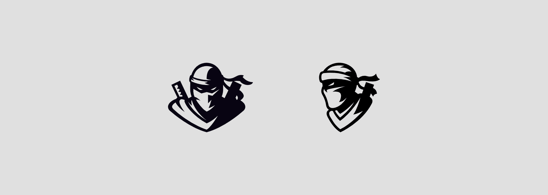

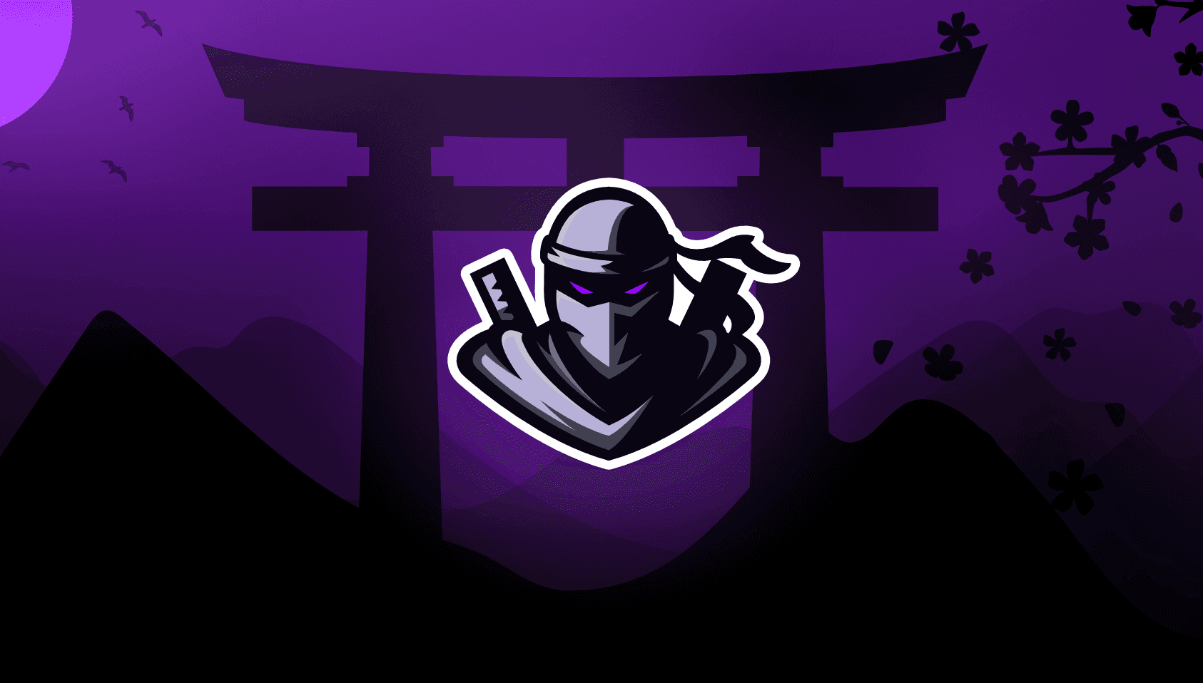
The idea was to create a ninja logo that was anonymous in appearance but still identifiable as the RelentlessNinja brand. We wanted to explore a couple of options in regards to the pose of the ninja. We created both a front facing version and a side angle version to present to the client so he could compare.
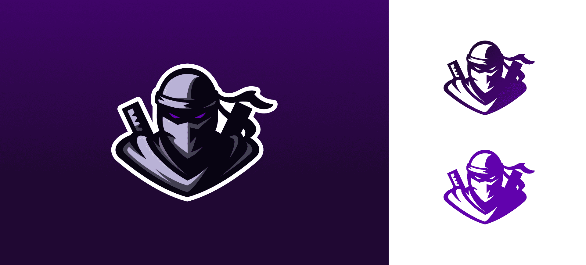
After the client decided he preferred the front facing one, we worked on the colouring and explored adding more elements to bring the mascot logo to life. We landed on a purple and black palette with some grey tones.
Background
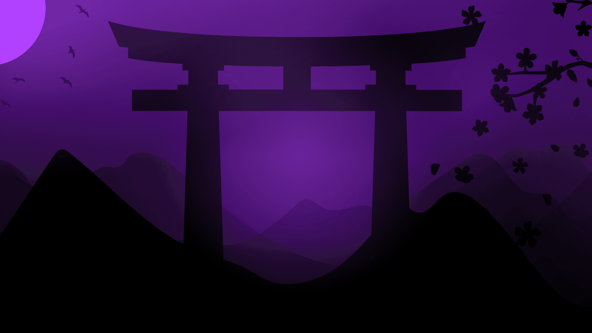
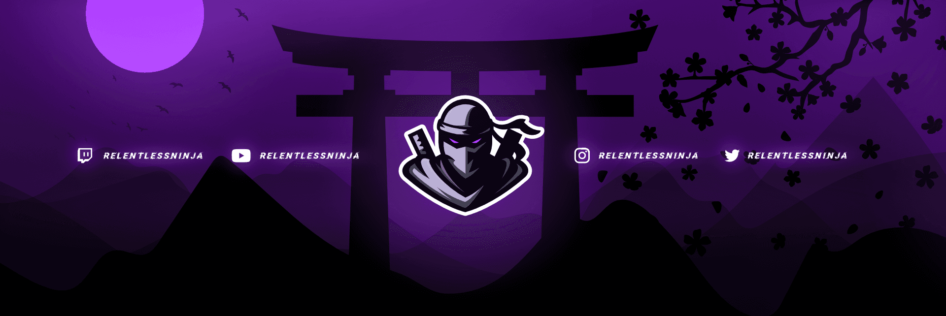
To compliment the ninja name and logo, we wanted to create an Asian inspired scene that could be used on the overlays and screens. We intended for the background to be quite dark and create an atmosphere that you would expect a ninja to reside in. We created the illustration to work for both the stream screen dimensions and the social media banner dimensions so that the branding looks cohesive and uniform across all platforms.
Animated Starting Screen
The animated screen features the background that we previously designed but adds some subtle motion to it such as the leaves moving in the wind. This adds more depth and professionalism to the streamers channel.
Lettering
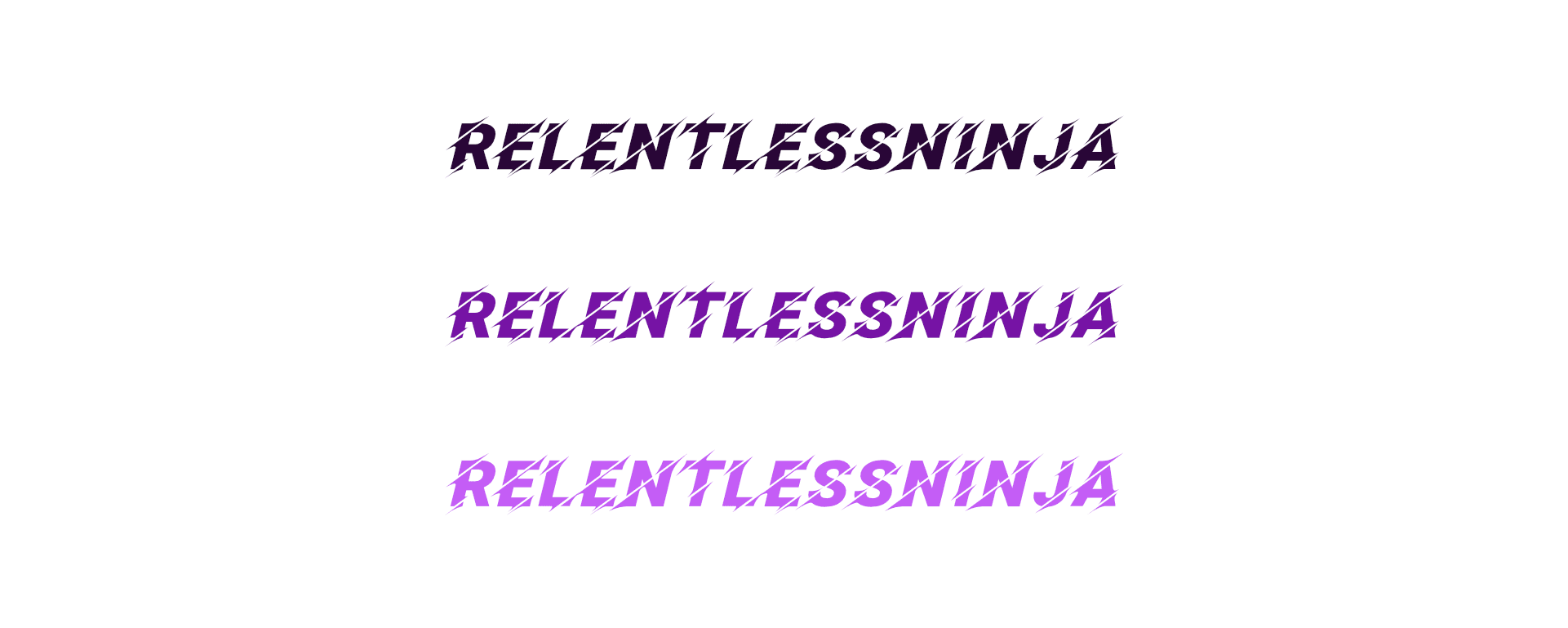
A more aggressive style of text was definitely applicable for this project. The goal was to use a font that worked well in the future animations. We particularly liked that the 'Facon' font has a slice effect through each letter which is relatable to the ninja and his use of a blade.
Stream Design
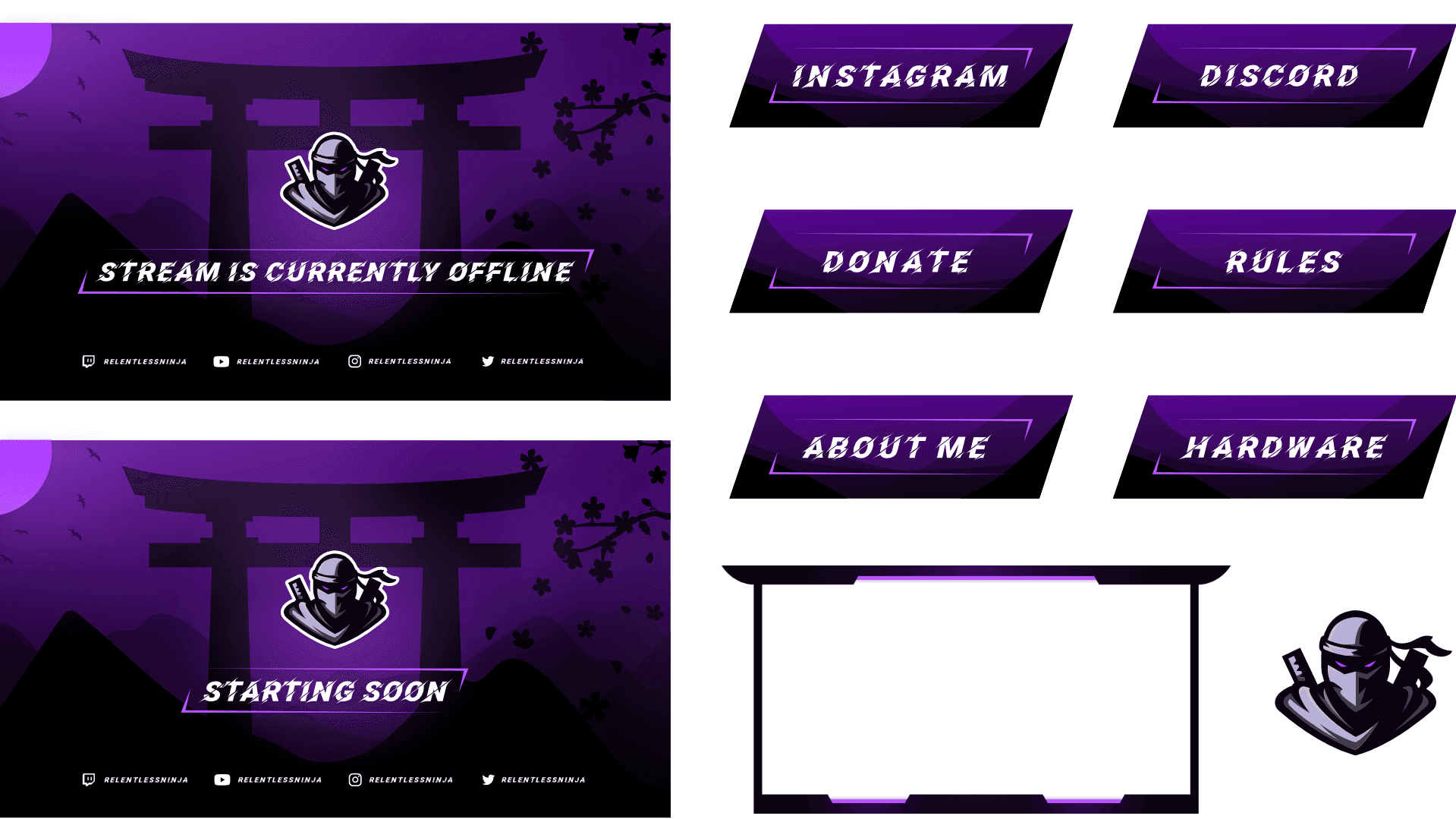
We created the twitch panels to match the rest of the branding. The webcam overlay design was created with Chinese architecture in mind, with the top of the border overlapping the sides.
Emotes

We crafted these cute emotes that align with the character traits of the main channel logo. In response to the client's request, we've come up with both a hype emote and a love emote. Initially, we present the sketches for review, and once they're approved, we add colour.
I love it!!! It all looks so amazing! I love the look of the dark theme and it's exactly what I was hoping for overall.
