MayaDucasse Twitch Graphics
Maya had a clear vision for her project: she aimed for a minimalistic vibe that wouldn't lean overly feminine. To achieve this, she requested a color palette featuring blues, reds, and oranges, coupled with sharp corners. The objective was to give her channel a modern and professional edge, while also crafting an iconic logo.
Logo
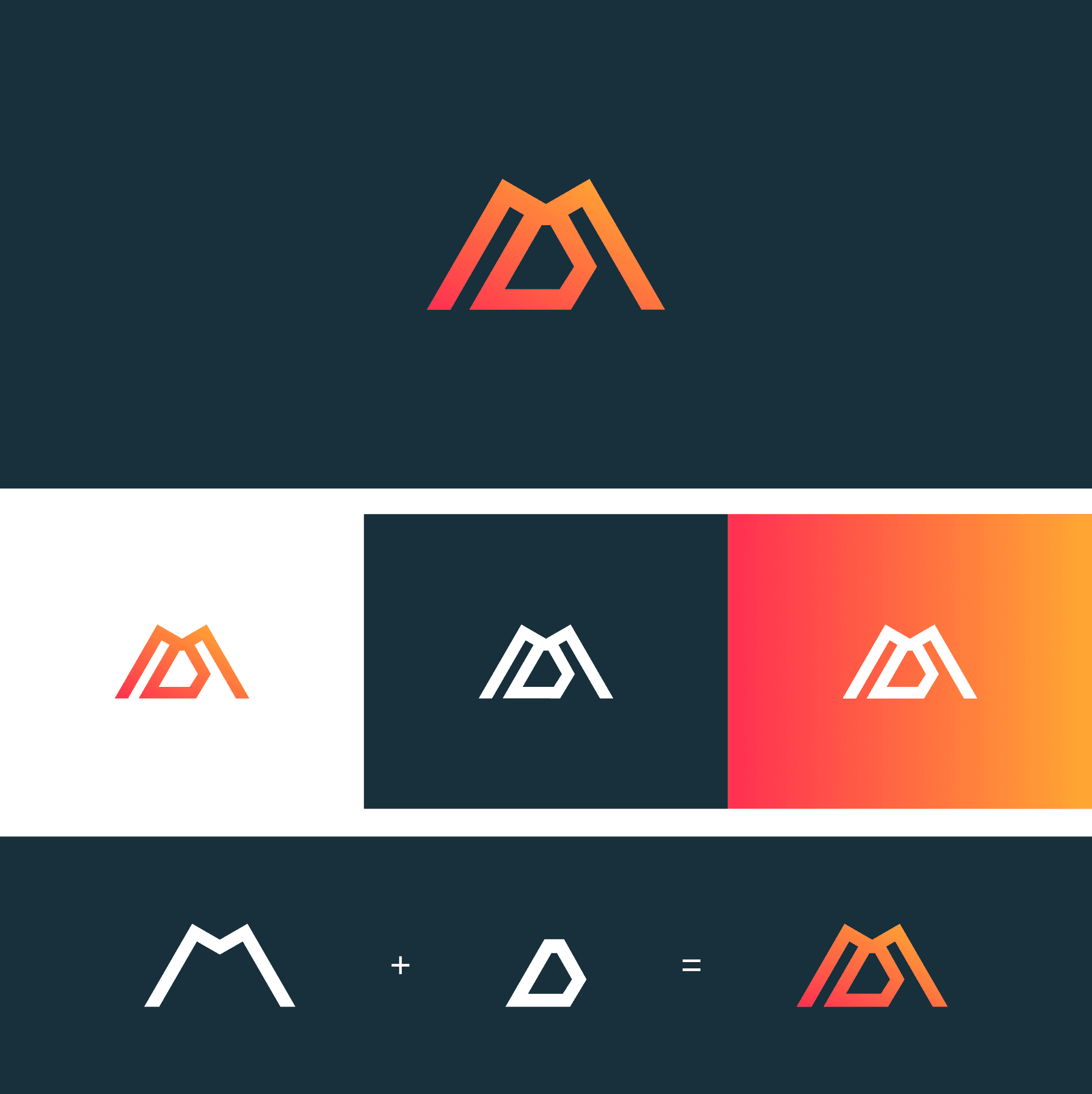
Here you can see a breakdown of how the logo is supposed to work. Both the 'M' and the 'D' are visible within one inclusive shape. The dark blue contrasts well with the orange and red tones.
Starting Screen
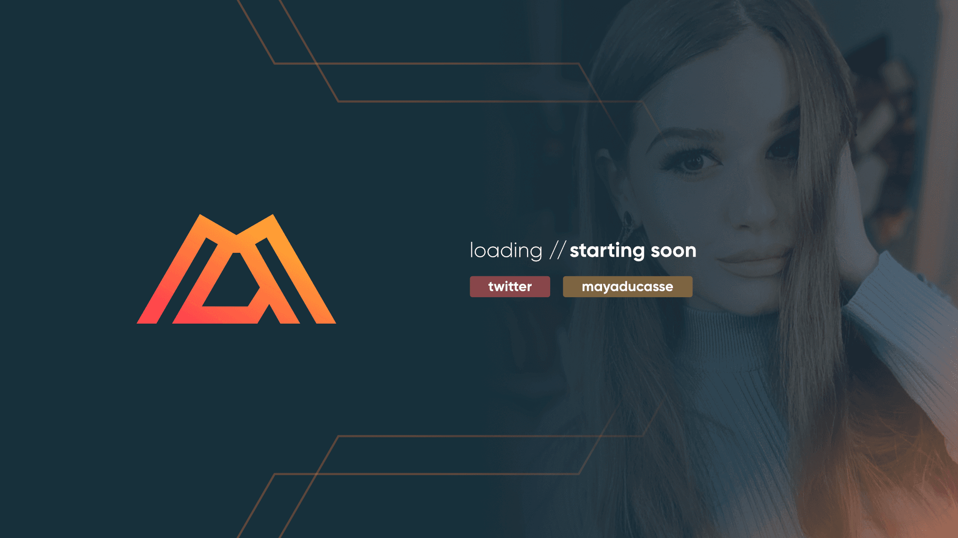
The starting screen continue with the minimal theme but adds some texture with a photo of the streamer herself.
Animated BRB Screen
Here is the animated BRB screen which includes two window captures. Perhaps one for chat and one for a gameplay capture. The animation keeps the viewers more a little engaged when the streamer is away from her computer.
Offline Screen

For the offline screen, we made a conscious decision to keep it text-free. This puts the logo front and center, giving the brand maximum emphasis. It also contributes to an ultra-clean overall visual appearance.
Im very happy with it. It looks really good and I can't wait to use it. Good job!
